Would you buy a pair of shoes without knowing the size of your feet? Probably not unless you fancied a painful walk home.
But this (or the equivalent) is a common approach to online interface design. The web’s littered with systems that try to force users to adapt to them, even if it doesn’t quite fit their needs.
Our new digital strategy at the British Red Cross emphasises the principle that design should be centred around the user – and ideally should be tested by the user throughout the design process.
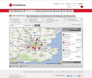
We’ve recently redesigned the “near you” postcode search on our website, which lets people in the UK find first aid courses, health and social care services and events near them.
 Feedback and testing
It’s a popular feature, with more than 10,000 searches last year. However, user feedback was that it was quite confusing to use. With an upcoming awareness campaign promoting our UK services, we needed to make sure people could find them more easily through our website.
We started with user testing. We sampled a group of internal and external users and watched them complete key user journeys. As well as this, we ran heat maps on the site.
We also did some guerrilla testing – we started trying to recruit users out on the street, but discovered this doesn’t work. We think people thought we were asking for money!
Approaching people in a local coffee shop worked much better – people had more time and were more engaged. We did offer an incentive of some shop vouchers, but many users said they were just doing their bit for charity and declined.
As well as gathering general feedback, we got these testers to complete timed user journeys to allow us to compare with the same journeys after launch.
Putting results into action
From all this (relatively inexpensive) research, some patterns began to emerge and we were able to formulate a plan for developing the search function.
We internally produced wireframes and designs, testing locally as we went along. When we were happy with the proposed solution we worked with our external developers to bring the revamped feature to life.
After deployment, we did a second round of timed user journeys. Over five test journeys, we found we’d drastically cut users’ time to complete the tasks by more than 70 per cent on average.
As well as working better on the site, we’re now also developing the search function into our first Facebook app.
You should always consult the user. It doesn’t have to be expensive or difficult – they’re right on your doorstep!

