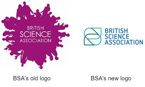
Every now and again, a good makeover is just what you need to freshen up and show off who you really are. This year, it was time for us at the British Science Association (BSA) to get our makeover.
On Monday 26 June, we launched our new visual identity. The fresh branding has been developed to better reflect and communicate the BSA’s mission and personality, while sitting alongside strong core-brands, such as the CREST Awards.
We were keen to build our profile and credibility among audiences, including policy makers, the media, and volunteers. However, the BSA has been around since 1831, so how does an organisation with such history take the necessary and potentially risky steps to change its look?

Three years ago, we had a big strategic review where a clear vision and sense of organisational mission was implemented: to make science a more fundamental part of culture and society. This has been passionately delivered by our staff and volunteers, resulting in many exciting initiatives, such as the Science: not just for scientists campaign, and our innovative running app, Run the Solar System.
However, we heard feedback that this core identity could be more clearly, consistently and compellingly communicated to external audiences. To help with the monumental task of rebranding, we recruited a specialist design agency, Juice by Design, to help throughout the process.
Firstly, we conducted a thorough brand audit to scrutinise how the BSA faired in comparison to similar organisations and analyse how effective the current branding was, considering its strengths, weaknesses and areas for improvement.
Following a rigorous examination of the BSA’s old branding, current vision, mission and programmes, the agency developed our new core brand visual identity which included: logos, icons, fonts and imagery. These better represent the BSA for what it is now and the work it does.
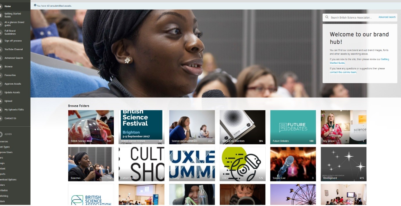
Coming up with a new core brand visual identity was just a small part of the process. We also created a brand-new website and cleaned up our current image library in the form of a centralised asset bank.
The new website was mocked up by website designer, Raising IT, who put a modern twist on our current concept, drawing focus to the important aspects of the BSA and creating a much more user-centric site.

We also identified “brand champions”, who sat in teams across the organisation to help us overhaul our visual assets, replacing hundreds of old pictures with a stock of fresh new images more suited to our new look and feel. These brand champions were also responsible for embedding the brand, ensuring old BSA branding was switched over to the new branding ahead of launch day. This included social networks, HR documents, web pages, and more. It was a nifty approach as it helped share the load and made sure everything was in place for the big reveal, while also giving staff members ownership over the new brand.
So far, the new brand has received hugely positive feedback from members of the organisation, its partners, and the public alike. Amy MacLaren, director of development and communications at the British Science Association, said that she was
…thrilled with the work the team from Juice has done – not only in better articulating our vision and values, while developing a professional look from a corporate perspective, but also in delivering a creative approach that works as the parent brand alongside our programme identities.”
She stressed that as an organisation with many well-known national programmes, each of which has a distinct and professional sub-brand to engage specific audiences, the challenge to develop a new core brand identity was “no mean feat”.
Uta Frith, the BSA’s incoming president, tweeted saying:
I love the fresh look of the British Science Association. Continuously modernised since founded in 1831”.
Changing your image can be scary, but sometimes, it’s just what you need to stay fresh, modern, and communicate your core beliefs and values. With the help of seasoned professionals and talented agencies, plus by rallying around your colleagues and staff members, developing and rolling out a new branding can be a rewarding and worthwhile process.
Read more

